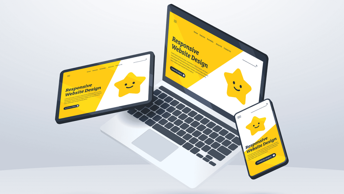
Crafting Seamless Experiences: 6 Responsive Web Design Tips for 2024
Prioritize Mobile-First Indexing
Google’s mobile-first indexing has been around for a while‚ but it’s more crucial than ever; This means Google primarily uses the mobile version of your website for indexing and ranking․ Therefore‚ ensuring your mobile site is fully functional and provides a great user experience is paramount․ Don’t treat mobile as an afterthought; it’s the primary lens through which your site is viewed․
Consider these points:
- Ensure all content and functionality are available on mobile․
- Optimize images for mobile devices to reduce loading times․
- Use responsive images to serve different image sizes based on screen size;
Embrace Fluid Grids and Flexible Images
Fluid grids and flexible images are the cornerstones of responsive design․ Instead of using fixed widths‚ use percentages for grid layouts․ This allows your content to adapt to different screen sizes seamlessly․ Similarly‚ use CSS to make images flexible‚ ensuring they scale proportionally without overflowing their containers․
Tip: Use the `max-width: 100%;` and `height: auto;` CSS properties on images to prevent them from exceeding their container’s width․
This approach ensures a consistent and visually appealing experience across all devices․
Optimize Touch Targets
Touch targets‚ such as buttons and links‚ need to be large enough and spaced adequately for easy interaction on touchscreens․ Small or closely spaced touch targets can lead to frustration and a poor user experience․ Aim for a minimum touch target size of 44×44 pixels․
Proper spacing and sizing are key to usability․
Leverage Media Queries Effectively
Media queries are the backbone of responsive design‚ allowing you to apply different styles based on screen size‚ orientation‚ and other device characteristics․ Use them strategically to tailor your website’s appearance and functionality to different devices․ Avoid overly complex media queries; keep them focused and specific․
Common Breakpoints
While there’s no one-size-fits-all approach‚ common breakpoints include:
- Small screens (phones): Up to 600px
- Medium screens (tablets): 600px to 900px
- Large screens (desktops): 900px and above
Prioritize Performance
Website performance is crucial for user experience‚ especially on mobile devices․ Optimize images‚ minimize HTTP requests‚ and leverage browser caching to improve loading times․ Consider using a content delivery network (CDN) to distribute your website’s assets globally․
Pro Tip: Use tools like Google PageSpeed Insights to identify performance bottlenecks and get recommendations for improvement․
A fast-loading website keeps users engaged and reduces bounce rates․
Test‚ Test‚ Test!
Thorough testing is essential to ensure your website is truly responsive․ Test on a variety of devices and browsers to identify and fix any issues․ Use browser developer tools to simulate different screen sizes and orientations․ Don’t rely solely on automated testing; manual testing is crucial for catching subtle UI problems․
Consider these testing methods:
- Real device testing
- Browser developer tools
- Cross-browser testing platforms
FAQ
What is mobile-first indexing?
Mobile-first indexing means Google primarily uses the mobile version of your website for indexing and ranking․ If your mobile site is lacking‚ your search rankings could suffer․
Why are fluid grids important?
Fluid grids allow your website’s layout to adapt to different screen sizes‚ ensuring a consistent and visually appealing experience across all devices․
What is a good minimum size for touch targets?
Aim for a minimum touch target size of 44×44 pixels to ensure easy interaction on touchscreens․

